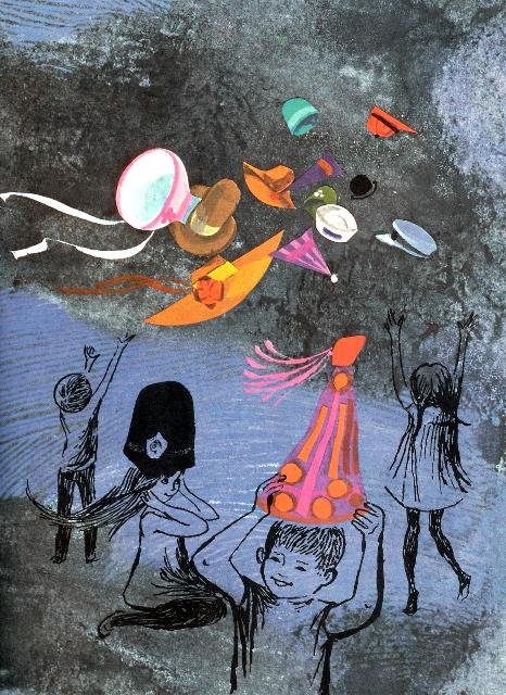
 One of the things I look for when I'm hunting for books is a distinctive illustrative style. Many of the Parents Magazine Press books feature a bold, mimimal style that uses a lot of line drawings. Here, I want to show off some illustrations from books I just listed. First, Attic of the Wind by Doris Herold Lund and illustrated by Ati Forberg, is a stunning combination of cloudy background with brilliant foreground.
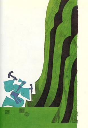 Next, The Stonecutter, though not a book I read as a child, seemed to fit perfectly among my collection, because of its bold, block-style prints.
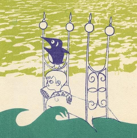 Finally, I found this very obscure book, The Bed that Went Whoosh to Moyle, neglected on the back shelves of a used book store. I knew I had to expose its quirky graphics to the world.
Upstairs, the penguin, was sad.
My father wrote The Bed that went Whoosh series. There are six in the set, and they were also translated into Irish. The illustrator was Bill Bolger who went on to become the Head of Design at the National College of Art in Dublin [NCAD]. Both are still alive and kicking. Great to see these pictures on the web. Perry Share.
ReplyDeleteI have all six books in the 'whoosh' series; I was given them (new) by a neighbour while I was in the hospital after surgery when I was four. I've brought them with me as I've moved around the world and I'm proud to say I love reading them to my kids!
ReplyDelete